Tag Archives: SQL Data Analysis

Working with analysis table columns

Once you have imported a data set into Easy Excel Analysis or SQL Data Analysis, an analysis table is created.  Here, we will described how to work with the analysis table columns.  We will be using the global superstore 2016.xlsx file for reference.
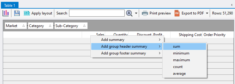
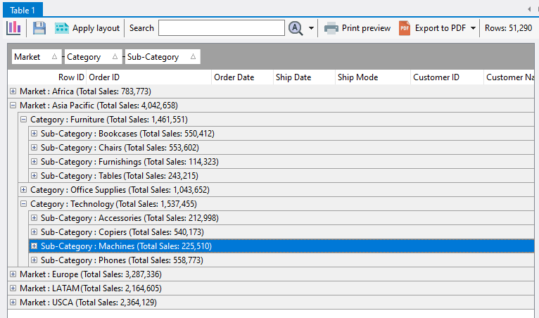
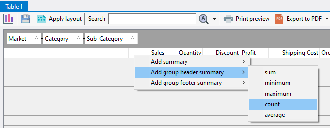
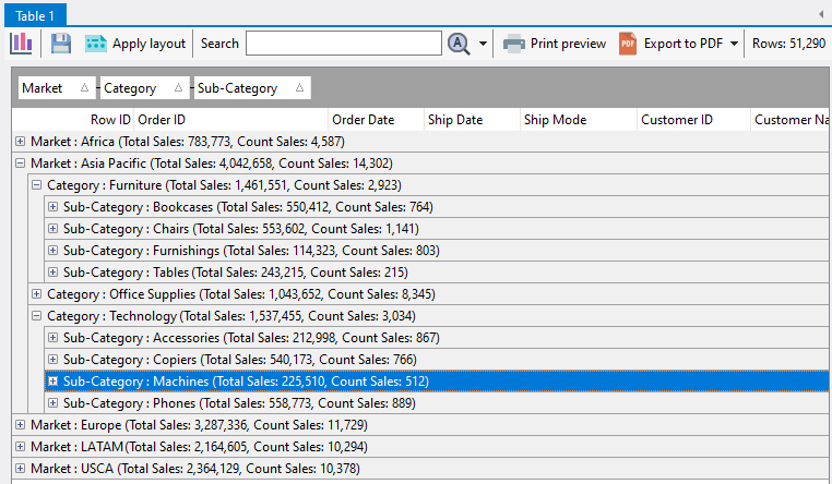
Creating summaries

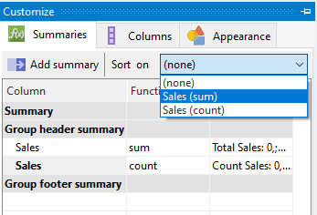
To create summaries, please refer to this post on how to create group and footer summaries.

Hiding columns

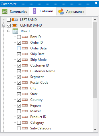
To hide or display columns, open the Columns tab of the Customize panel.  Select a column to make it visible, or deselect it to hide the column.

Freezing columns

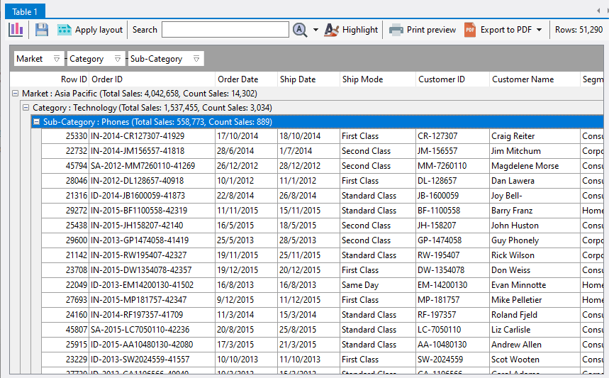
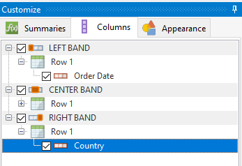
In Easy Excel Analysis or SQL Data Analysis, you can freeze columns on the left and right of the analysis table e.g. in the table below, the Order Date column is frozen on the left, and the Country column is frozen on the right.

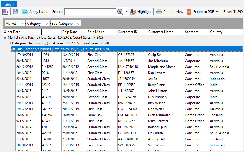
When you scroll the table horizontally, these 2 columns will remain fixed in their position.

To freeze columns, first ensure that the LEFT BAND and/or RIGHT BAND items are selected in the Customize panel.

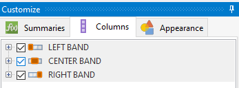
Then drag and drop columns onto either of those 2 items to freeze the columns in those bands.
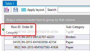
Stacking columns

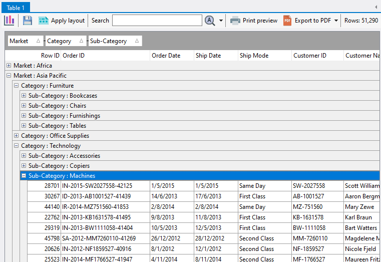
You can stack columns by dragging them to a new column row, to create layouts like this:

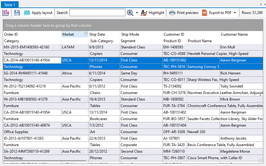
Notice that the Category, Sub-Category, Segment, Product ID, and Product Name columns are displayed on the second row.

To stack columns, click on a column header and drag it to below the row where you want to create a new row.  You will create a new row if you see the green horizontal indicator arrows.  In the example below, we are dragging the Category column to create a new row.


Using analysis tables

Once you have imported a data set into Easy Excel Analysis or SQL Data Analysis, an analysis table is created.

In this example, we’ve imported the global superstore 2016.xlsx file.  What you can do now is to group the rows by one or more columns.  To add a column to the group, click on the column header and drag it to the column headers area.

Here, we have grouped our rows by Market, Category, and Sub-Category.

At this point, you can easily analyze the sales data for each level of the grouped columns.  You can add as many columns to the groups as you require, and you can also change the order of the grouped columns by arranging it in the appropriate order.

We will now create summary values for each grouping level.  To create a summary, right click on a column header in the table, and select the required summary.  In our example, we will create a group summary based on the sum of the Sales column.

Once created, the summary value is displayed on all of the grouping levels.

You can add multiple group summaries by repeating the process above.  Here, we have added another summary to display the total sales orders.

To sort the groups by the summary values, you will need to select the summary item to sort by from the Customize menu.  Here, we have chosen to sort by the Sales (sum) summary.

All grouping levels will then be sorted by that summary value in ascending order.

You can now quickly see which groups have the highest sales.  You can sort the summary values in descending order by clicking on the grouped column.  This symbol (highlighted in red below) indicates that the summary values are sorted in ascending order:

and this symbol indicates the summary values are sorted in descending order.

See also: