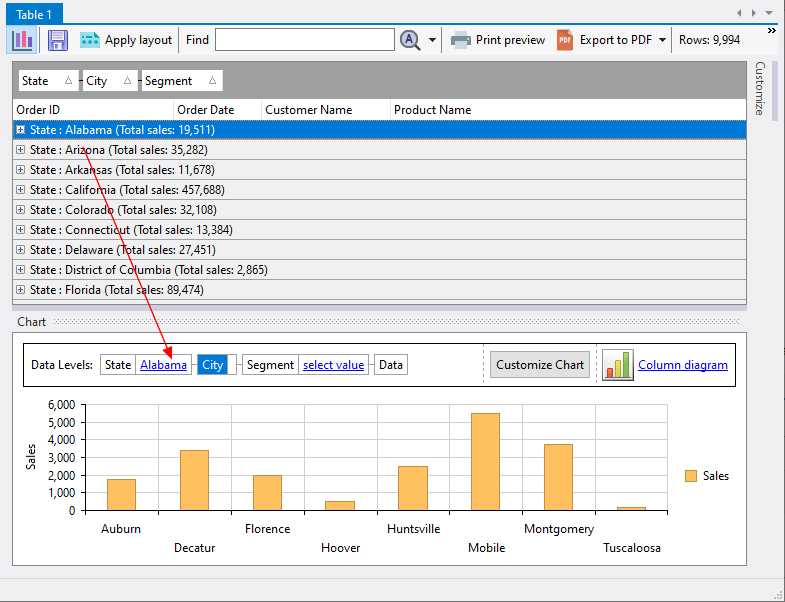
The analysis chart responds to how the data is displayed in the analysis table. For example, if we click on Alabama in our analysis table, the chart drills-down one level to display the Sales result for all the cities in Alabama.
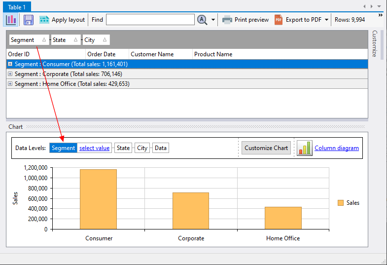
If we rearrange the grouping columns so that the Segment group comes first, the chart will adjust accordingly.
You can also drill down to deeper levels on the chart by clicking on the relevant bar on the chart. Where possible, the analysis table will also display the selected grouping and its details. For example, if we click on the Corporate value in the chart:
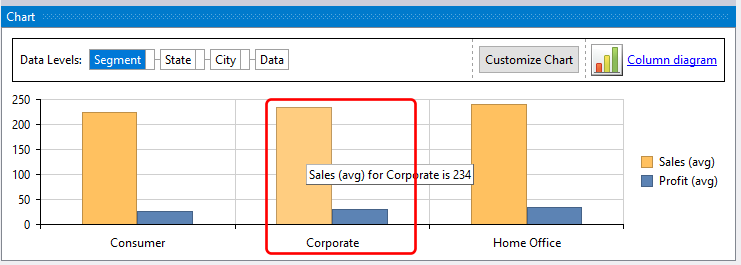
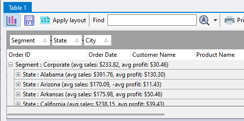
the analysis table will be updated to display the Corporate level details:
and the chart will also drill-down to the Corporate level data.
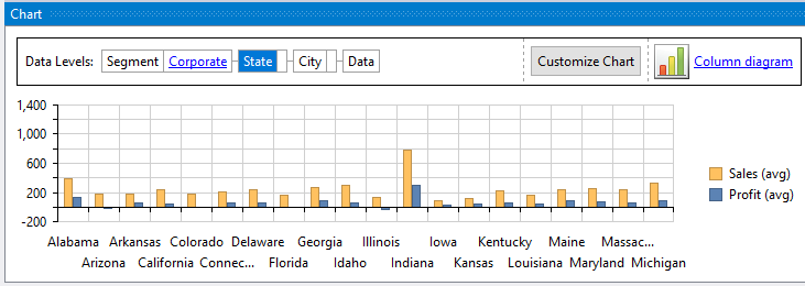
You can drill-down to as many groups as you have defined in your analysis table. In our example, we can drill-down further to each State value, and finally to the City values.