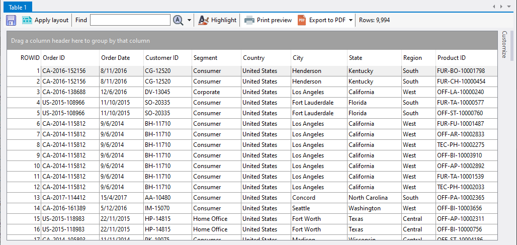
An analysis table looks very much like a spreadsheet.
which you can transform into something meaningful and visually informative using the various settings offered by Easy Excel Analysis.
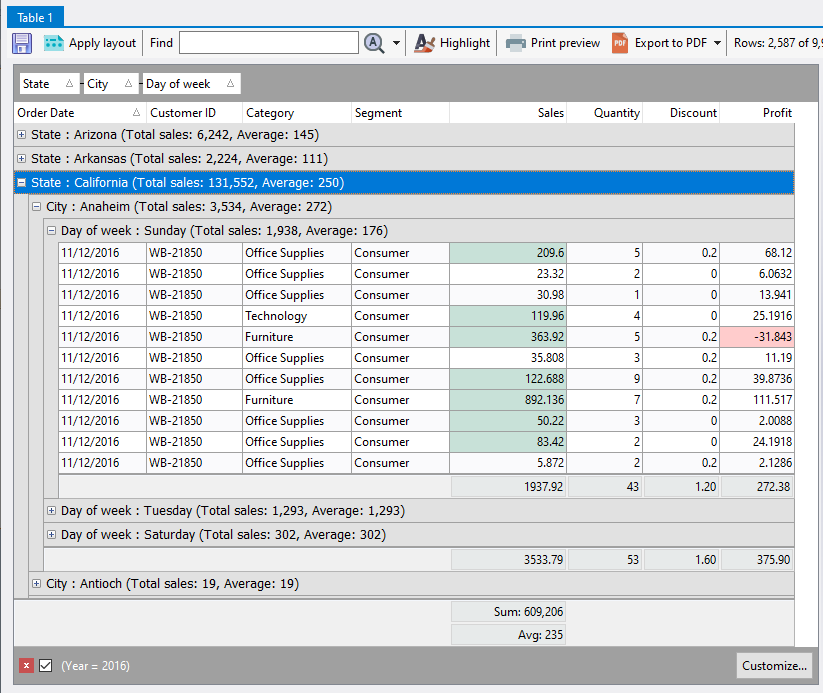
This topic explains how you can change the analysis table's appearance. You can perform the following actions to gain meaningful insights from the data:
•calculate summaries from your numeric data
•group columns into logical groupings and calculate summaries based off those groups
•highlight exceptions
•sort one or more columns
•filter your data to drill-down to specific items
•analyze and browse your data visually using charts