In Easy Excel Analysis and SQL Data Analysis, you can use charts to visualize the data created in analysis tables. A pre-requisite is that you analysis tables must have groups and summary values as described here.
Each grouped column serves as a level in the chart, and each summary value is the chart’s measure. For example, we have the following analysis table layout created based on the global superstore 2016.xlsx data.
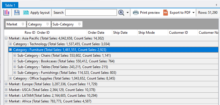
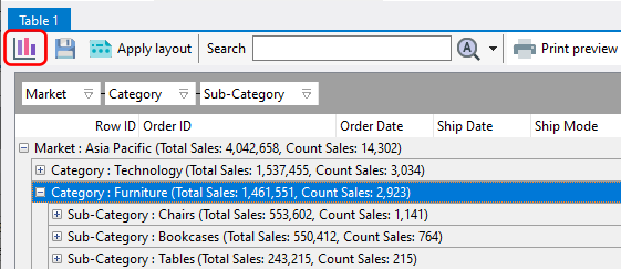
We have 3 grouping levels, and 2 summary values. To create a chart, click on the chart icon:
A chart is displayed on the bottom of the analysis table.
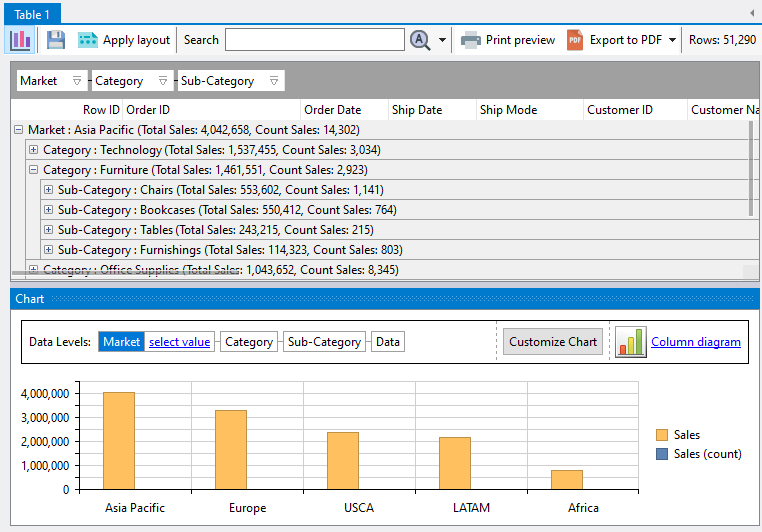
Clicking on the analysis table will update the chart accordingly, and vice versa. For example, if I click on the Europe item in the chart:
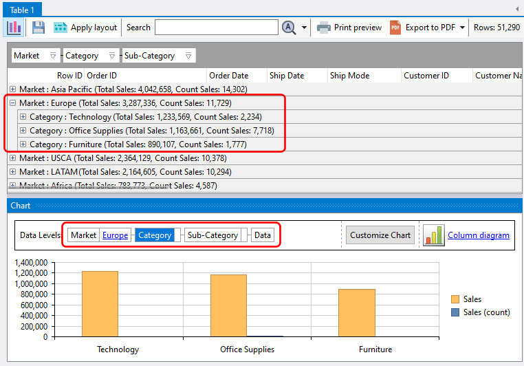
the analysis table automatically expands the Europe grouping level, and the chart also displays the grouping level below Europe, which is the item category level.
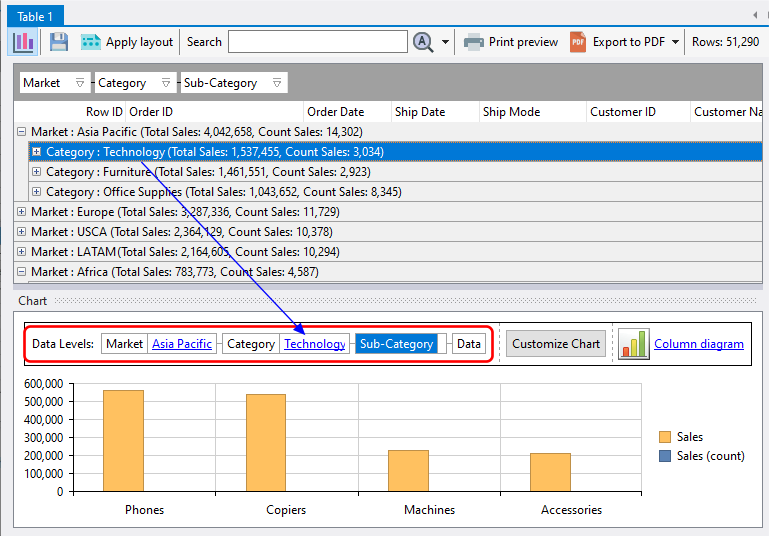
Likewise, if we click on a grouping level within the analysis table, the chart will also drill down to the corresponding level.
