Category Archives: SQL Data Analysis

Using charts in your analysis tables

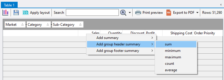
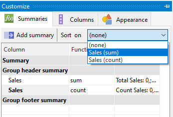
In Easy Excel Analysis and SQL Data Analysis, you can use charts to visualize the data created in analysis tables.  A pre-requisite is that you analysis tables must have groups and summary values as described here.

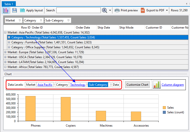
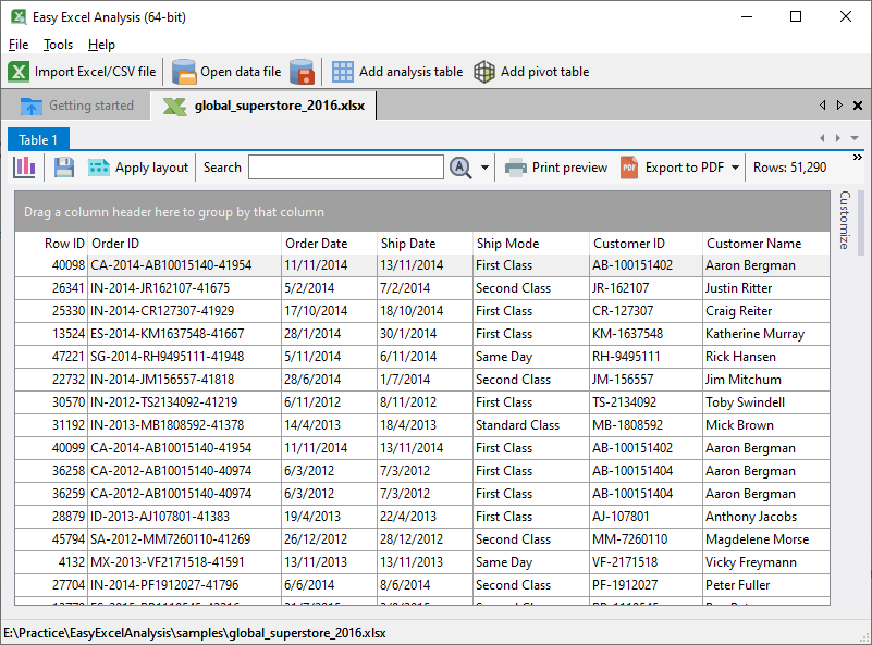
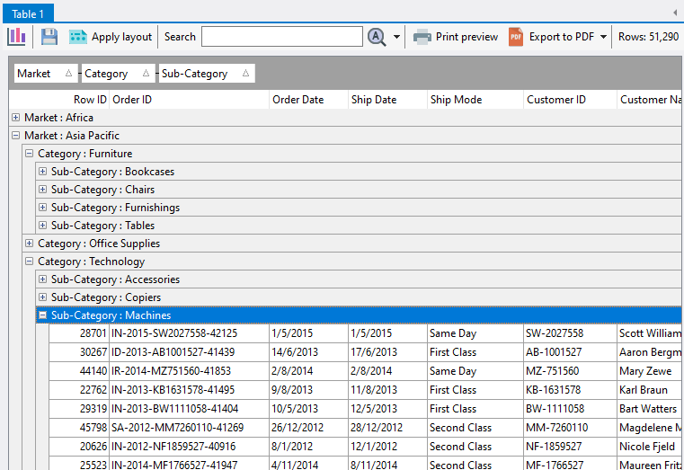
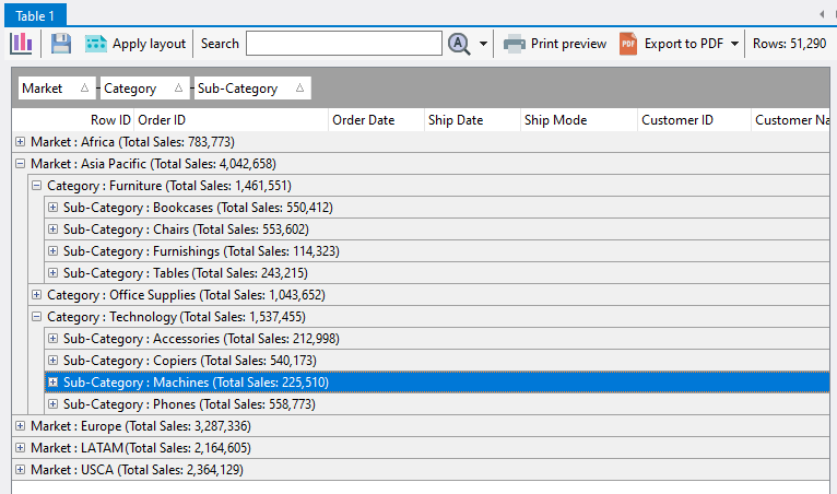
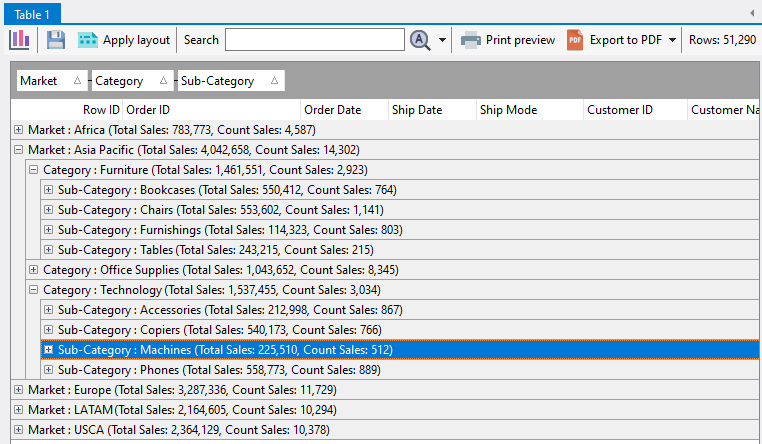
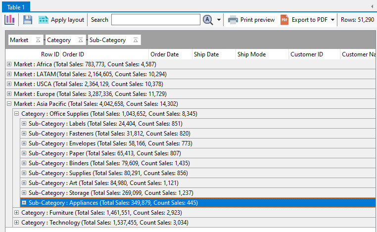
Each grouped column serves as a level in the chart, and each summary value is the chart’s measure.  For example, we have the following analysis table layout created based on the global superstore 2016.xlsx data.

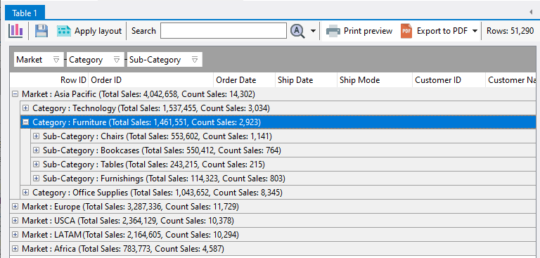
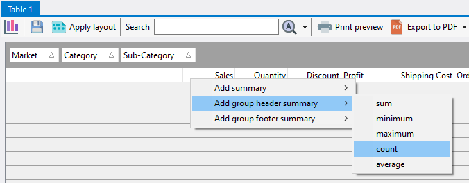
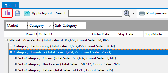
We have 3 grouping levels, and 2 summary values.  To create a chart, click on the chart icon:

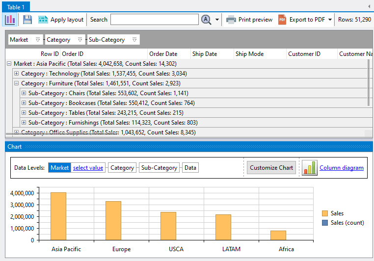
A chart is displayed on the bottom of the analysis table.

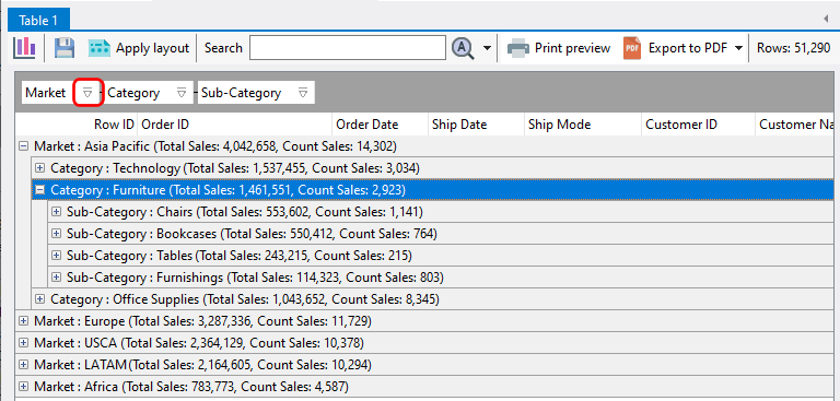
Clicking on the analysis table will update the chart accordingly, and vice versa.  For example, if I click on the Europe item in the chart:

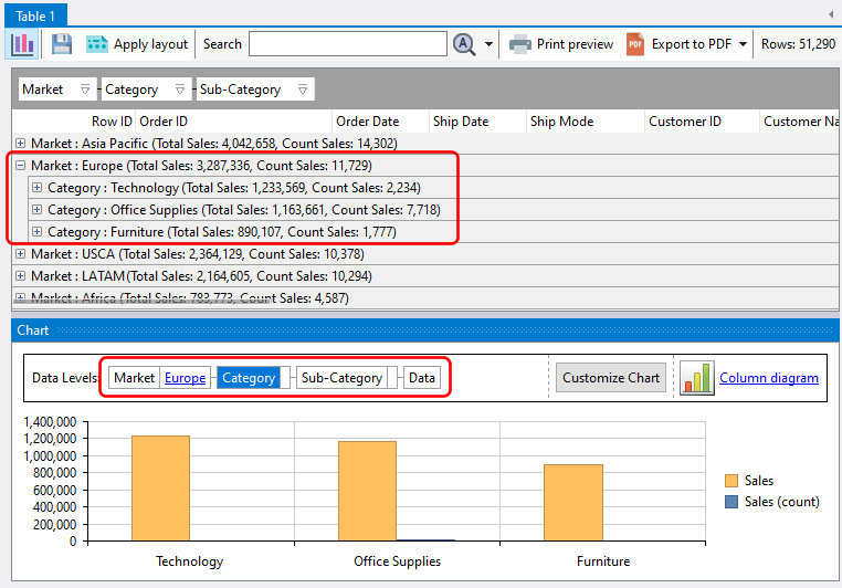
the analysis table automatically expands the Europe grouping level, and the chart also displays the grouping level below Europe, which is the item category level.

Likewise, if we click on a grouping level within the analysis table, the chart will also drill down to the corresponding level.


Using analysis tables

Once you have imported a data set into Easy Excel Analysis or SQL Data Analysis, an analysis table is created.

In this example, we’ve imported the global superstore 2016.xlsx file.  What you can do now is to group the rows by one or more columns.  To add a column to the group, click on the column header and drag it to the column headers area.

Here, we have grouped our rows by Market, Category, and Sub-Category.

At this point, you can easily analyze the sales data for each level of the grouped columns.  You can add as many columns to the groups as you require, and you can also change the order of the grouped columns by arranging it in the appropriate order.

We will now create summary values for each grouping level.  To create a summary, right click on a column header in the table, and select the required summary.  In our example, we will create a group summary based on the sum of the Sales column.

Once created, the summary value is displayed on all of the grouping levels.

You can add multiple group summaries by repeating the process above.  Here, we have added another summary to display the total sales orders.

To sort the groups by the summary values, you will need to select the summary item to sort by from the Customize menu.  Here, we have chosen to sort by the Sales (sum) summary.

All grouping levels will then be sorted by that summary value in ascending order.

You can now quickly see which groups have the highest sales.  You can sort the summary values in descending order by clicking on the grouped column.  This symbol (highlighted in red below) indicates that the summary values are sorted in ascending order:

and this symbol indicates the summary values are sorted in descending order.

See also: